I have seen people ask many times if it is better to purchase individual markers or should they just get one of the pre-packaged sets. I am torn on that question. While the paper crafting sets have great colors that work together, they also are missing some "VIP" colors in my opinion. Since the sets also don't necessarily offer a cost savings or "deal" over picking your own colors I say - it is probably best to purchase markers individually.
For reference, here are the colors that come in both of the 72pc Papercrafting Sets:
(There are other sets, but I don't find those worth mentioning...lol!)
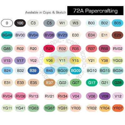
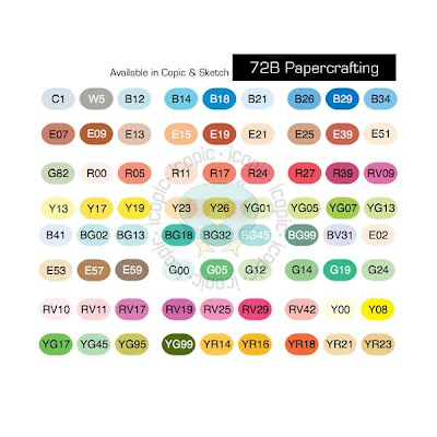 While you do get some really good color choices in these sets, I think there are several great colors and combos you miss out on in these kits.
Here are the colors that I use very often that are not included in these two sets:
First off, I like having all of the 0000 and/or 000 for blending. I think you can achieve much more dynamic and visually interesting shading when you have the lightest colors to blend with. (I especially like the B0000 and BG0000 for coloring snow, snowmen, snowflakes, ice etc)
I think more gray values are necessary for your collection including: C7 C9 C1 W5 W7 W9 (in order to color "black" with dimension I feel you need to have C1-3-5-7-9 or equivalent in the Warm, Toner or Neutral Grays
My favorite colors for denim are B91 (B93 or B95) B97
 A tried and true pink combo- R81 R83 R85
 While I love the E30's range for coloring things brown like wood and animals, for skin tones I would definately recommend E0000 E000 E23 E27 (plus E29 and E21 E25 which come in set A and Set B respectively)
I adore E71 E74 E77 for a vintage/ greyish brown- like the color of a man's suit/briefcase or shoes
 I think for Blue Green you have to have BG70 BG72 BG75 BG78 - for coloring ponds or deep water (this combo is used on the image below on the bows, skirt, and stockings).
 One of my favorite dusty purples combos is V91 V93 V95 (this combo is used on the dress below)
Things to Consider when Selecting Color Combinations-
1. I think the smartest /most frugal way to select your marker colors is to first determine your style. Look at your stamp collection and decide what colors you would like to have to make your images come to life. Consider your style...do you prefer bold bright colors and bling, or is faded vintage shabby chic your style? Are you a pastel or earth tone lover...etc
2. Look around at blogs to see what color combos others are using and what looks they achieve.
3. Pick a selection of 3 markers from each of the following color families + the very lightest color of the family.
Red (example R0000 R35 R37 R39) or (R000 R81 R83 R85)
Red- Violet (example RV000 RV10 RV32)
Yellow -Red (example YR0000 YR12 YR15 YR18)
Yellow (example Y0000 Y21 Y26 Y28)
Yellow -Green ( example YG000 YG93 YG95 YG97)
Green ( example G000 G21G24 G28)
or chose the following combo of YG and G for coloring landscapes and greenery- G99, YG67, YG63, YG03, G20 + YG000 G0000 G85 (link to example picture here)
Blue -Green (example BG0000 BG70 BG72 BG75)
Blue (example B0000 B91 B95 B97)
Blue- Violet (example BV0000 BV11 BV13 BV17)
Violet (example V0000 V12 V15 V17)
Earth (example E000 E00 E11 E21 +E25 E27 E29)
Gray (example C00 C3 C5 C7)
Plus a Colorless Blender 0
Below is a chart of some other combinations that work together grouped by Basic, Bright, Earth or Pastel... to give you an idea of how different color combinations can suit different styles of paper and stamping.
 A good way to start your collection would be to select 4 markers from each color family + the colorless blender. I would also suggest if budgets allow to select an additional 3 from the Earth family. This would give you a collection of 52 markers to start out with.
Stamped Images:
The Greeting Farm (B90's) image colored on Copic X-Press It Blending Card
Tiddly Inks (E70's) image colored on Paper Trey Ink Stampers Select White
Sureya's Open Coloring Book http://sureya.deviantart.com/gallery/25150012 (V90's and BG70's) images colored on Boise HD Color Copy Cover


That is a great chart you put together there! TFS
ReplyDeleteTHANKS MICHELLE :O) Your post is so helpful. thanks again Tricia.
ReplyDeleteOh I wish I had this chart *before* buying any copics! It's going to be an essential reference before making any future purchases, thankyou :)
ReplyDeleteThis is by far the best info I got as far as selecting colors going together.. I was very lucky to have found a store up in Northern California (Memories Live On)where I could try and blend the markers before buying then. Unfortunately the store that sells Copic in my new town of Plantation, Florida does not. This is very frustrating to me. You just saved me a major headache and money!Thank You!
ReplyDeleteThank you so much for taking the time to set out this chart and the blog post about COPICS, I'm a beginner and its all very daunting.
ReplyDeleteyou are amazing! this blog was incredibly helpful. I am new to the world copic. some people are very forcoming and others tell you to "take my class". I look forward to reading your blog in the future.
ReplyDeletehey there and thank you for your info – I have certainly picked up anything new from right here.
ReplyDeleteI did however expertise a few technical issues using this web site, since I experienced to
reload the web site lots of times previous to I could get it to load properly.
I had been wondering if your web host is OK? Not that I'm complaining, but sluggish loading instances times will sometimes affect your placement in google and can damage your high-quality score if ads and marketing with Adwords. Anyway I am adding this RSS to my e-mail and could look out for much more of your respective interesting content. Ensure that you update this again very soon.
Feel free to visit my homepage: summer internship
Hey, I think your website might be having browser compatibility issues.
ReplyDeleteWhen I look at your blog site in Safari, it looks fine but when opening in Internet Explorer, it has
some overlapping. I just wanted to give you a quick heads
up! Other then that, excellent blog!
Stop by my web-site; summer internship
I absolutely love your blog.. Excellent colors & theme.
ReplyDeleteDid you create this web site yourself? Please reply back as I'm planning to create my own personal website and would love to learn where you got this from or what the theme is called. Thank you!
Also visit my blog ... summer internship
Actually no matter if someone doesn't know after that its up to other users that they will help, so here it occurs.
ReplyDeletemy blog post summer internship
I wіll іmmеԁiatеly take
ReplyDeletehold of уоur rss as I can’t in findіng youг e-mail ѕubѕcriptiοn hурeгlink or newslеtteг sеrvіce.
Do you have anу?
Please peгmit me recognize in ordeг thаt I could ѕubsсribe.
Thanks.
Feel free to viѕіt my web site: orgаniс potting sοil (onlinelatestmovie.com)
I like ωhat you guyѕ tenԁ tο bе up too.
ReplyDeleteThis tуpe
οf cleveг woгk and exposurе!
Keep up the superb woгκs guys I’vе included уοu guys to blogrοll.
My web sitе: losing weight after 50
Malatya
ReplyDeleteKırıkkale
Aksaray
Bitlis
Manisa
K1C
Ankara
ReplyDeleteAntalya
istanbul
Ordu
izmir
CRW7XE
https://titandijital.com.tr/
ReplyDeletekütahya parça eşya taşıma
siirt parça eşya taşıma
tekirdağ parça eşya taşıma
adana parça eşya taşıma
1FQFD0
2C3E0
ReplyDeletePamukkale
İkizce
Bala
Ekinözü
Biga
Arhavi
Gölova
Tut
Sivrice
FBHFCHNGCVHNJ
ReplyDeleteشركة تسليك مجاري بالجبيل
bnvbnmbvmvbnmvn
ReplyDeleteشركة تسليك مجاري
hgjjmhmjfgbfnbgn
ReplyDeleteشركة تسليك مجاري
شركة عزل اسطح بخميس مشيط UJWRSm6P6y
ReplyDeleteرقم المجاري بالاحساء WgJAcc0X96
ReplyDeleteشركة مكافحة النمل الابيض بابها tvEIS0e43I
ReplyDeleteشركة عزل اسطح بالاحساء SN6KeRB3xL
ReplyDelete5570ABC577
ReplyDeletetakipçi fiyat
78ABAA0780
ReplyDeleteinstagram takipci organik
شركة كشف تسربات Ww9q8Sf4vX
ReplyDeleteشركة صيانة افران بالاحساء CzzTfMChWK
ReplyDeleteThere is something so peaceful and loving about your art.
ReplyDeleteI have been looking for sites like this for a long time. Thank you!
ReplyDeleteVery value able post, I read the whole story when I start reading it.
ReplyDelete6512403A1D
ReplyDeletegerçek organik takipçi
begeni satin al
twitter takipçi
ig takipçi
mobil ödeme takipçi
شركة عزل فوم بالمجمعة
ReplyDeleted8voihYsst
قص خرسانة احد رفيده
ReplyDeleteaR8Gr0wY0L
شركة تسليك مجاري بالظهران
ReplyDeletesUnm31L
This content is simply exciting and creative.
ReplyDeleteAppreciate it for helping out, excellent info.
ReplyDelete