Showing posts with label favorite copic color combos. Show all posts

Wednesday, February 6, 2013

Got Washi and Copic Color Matches for Basic Grey Soleil


I am loving the Basic Grey Soleil collection of papers!  These are all my favorite colors.  I thought it would be cute to color up Saturated Canary image Washi Tape Kinda Girl and pair it up with this cute paper.  I threw in some assorted washi tape from my collection and broke out my Spellbinders Nestabilities Card Creator A2 Dies to make the layers nice and straight.  I can honestly say that did not miss measuring on the paper cutter, not one little bit.  I used a Lil Inkers die to cut out the background on the sentiment and a random heart sticker. 


Some Copics color matches for the Basic Grey Soleil Collection:
R81 R83 R85  Y00 Y13 Y18  V12 V15 V17

Supplies:
Stamp: Washi Tape Kinda Girl digi by Saturated Canary
Paper: Bosie HD Color Copy Cover, Basic Grey Soleil
Copics: Hair-E50 E31 E33 E37 E59 Eyes- B05 Skin-E000 E00 E11 RV42
R81 R83 R85 Y00 Y13 Y18 V12 V15 V17



Monday, February 4, 2013

Hugs and Kisses and Copic Matches for Carta Bella Devoted


Happy February!

I can't believe we are well into the second month of the year already.  I do so love making cards in February.  Valentine's Cards are so fun and easy to make. 

I have not been making very many cards lately as I prefer to use digi images.  When I got my new state of the art HP Envy All In One printer I quickly realized that it was no good for printing digis because the ink would make a smeary mess when I colored with my Copics.  Two weeks back I saw an ad in the Walgreens circular for a Cannon Pixma IP2702 (no frills) printer for only $19.99.  I couldn't believe how low that price was so I went to the store and decided to buy it.  Well that super cheap printer comes with ink that is compatible with Copics. I have to manually force the cardstock to get it to feed through but once you hold it, it will grip the cardstock and it feed straight through.   I was so happy I took a chance on it. I now refer to it as my Digiprinter!

I had a ball over the weekend coloring up this cutie from Saturated Canary. Hope you like her!

Copic Colors to Match Carta Bella Devoted Collection:
Supplies:
Stamps:Hugs and Kisses by Saturated Canary
Paper and Stickers: Devoted by Carta Bella
Stampin' Up ribbon
Frayed Burlap Distress Ink
Copics: Hair-E50 E31 E33 E37 E59 Eyes- B05 Skin-E000 E00 E11 RV42
E70 E71 E74 E79 BG70 BG72 BG75 BG78 R46 R56 R59 R81 R83 R85 E35


Wednesday, January 2, 2013

New Year's Resolution and Copic Color Combos


Happy New Year!  What are your New Year's Resolutions?  Mine are to get organized, get healthy, and to get crafty more often.  

In honor of resolution numbers 1 and 3, I wanted to share with you a storage unit I won on the Marker Pop facebook page.  The photo above is the Crafter's Companion The  Ultimate Pens and Markers Storage Each unit is $7.99 each and holds 12 markers.  Above I have used 6 units.  

I have chosen to place some go to color combos in the unit and it sits on top of my other storage that I already had.  I like these units and how organized they keep things.  

Below is a chart of Copic's new blending sets (the yellow combo I used Y19 instead of their recommended Y18).  


Below is a chart of some of my go to color combinations that I have filled my unit with.

Tuesday, December 11, 2012

New Copic Blending Sets...more options for choosing Copic Color Combinations.

Have you seen the news over on the Copic Marker site?  They just released new copic blending sets in 3's!

Copic has taken the guess work out of choosing colors with their new Color Fusion and Blending Trio Sets.

It looks like there are 6 Color Fusion and 7 Blending Trio sets. 

This is the information from the Copic Marker site-


Color Fusion Sets- are an affordable way to achieve perfect blends.  The set contains three preselected colors in an ideal belnding group.

Color Fusion Set 1: V20-S, V22-S, V25-S

Color Fusion Set 2:  RV000-S, RV52-S, RV55-S

Color Fusion Set 3: E04-S, R56-S, R59-S

Color Fusion Set 4: YR20-S, YR23-S, YR27-S

Color Fusion Set 5: G40-S, G43-S, G46-S

Color Fusion Set 6: B01-S, B04-S, B06-S


Blending Trio Sets- great for starting or extending your collection.  Combinations selected to deliver perfect blends every time!

Blending Trio Set 1: G40-S, G94-S, G99-S

Blending Trio Set 2: B12-S, B14-S, B18-S

Blending Trio Set 3: RV63-S, RV66-S, RV69-S

Blending Trio Set 4: R12-S, R14-S, R17-S

Blending Trio Set 5: Y00-S, Y13-S, Y18-S

Blending Trio Set 6: E95-S, E97-S, E99-S

Blending Trio Set 7: E70-S, E74-S, E79-S

The Copic Marker site is selling the sets for $20.97 each.  That is the MSRP of $6.99 a marker. Ouch!  Maybe you can ask Santa to stick some of these in your stocking!


Thursday, June 7, 2012

Copic Color Combinations, To Ciao or not To Ciao


Happy Thursday!  Sorry I have been so quiet.  I have all these great cards to show you and have had zero time during "daylight" hours to photograph them.  Even with a lightbox I feel my photos come out horrible if I take them at night.   

In lieu of a project, I thought I would share with you some Copic charts I made.  The topic today is "To Ciao or Not to Ciao"!

The chart above is inspired by the Copic Club that Lime Tart offers which contains a combo of Ciao and Sketch markers.  They are a really great online store in Australia that sells the cutest monthly scrapbooking kits and their selection of Washi tape is awesome.  They do Marker Mondays on their blog and have really great resource material for Copics.  If I was down under I would have joined their Copic Club just to get the binder of handouts.  It is so well put together!

"To Ciao or Not To Ciao"
I have said numerous times before that I am an advocate of mixing Ciao and Sketch markers in your collection.
Reasons To Ciao-  I like Ciao markers a little bit better because they are easier to hold (just like a pen) and they are lighter in your hand and easier to maneuver.   If you are not OCD I think it works to your advantage to mix and match and get the most for your money.  Copic Ciao markers hold less ink and cost less money so it makes sense from a budget approach if you want a bigger collection, to fill your Sketch collection with Ciao markers.  
Reasons Not to Ciao- Only 180 colors available.  Some people prefer a neat looking collection, all their markers in the same kind of holder with a uniform look. Some people don't like them because they are round and can roll off the table.  They don't fit into the Airbrush grip directly.  (I use mine in the ABS grip with a piece of double stick foam to hold them in, works just fine.)  

I recommend investing in Sketch markers for lighter colors that you will be using more often to blend and to get your darker colors or ones that you will use less frequently as Ciao markers. 

Suzanne on Splitcoast Stampers was looking to purchase Copic markers, but for budget reasons, she wants to get all or mostly Ciao markers.  She sent me a list of colors that she was thinking about purchasing and I tried out the combos for her to see how well they blend.  While some of the combos work really well together, there were some that I found a bit challenging. 

Below is a picture of how those color combinations turned out:
BV000 BV13 BV17 while you can make this work, a smoother transition would be:
BV02 BV13 BV17.
V01 V05 V09 works but blends better if you add V06 to it.
R20 R24 R29 works also but blends better if you use R22 R24 R29.
YR000 YR31 YR68.  I was not fond of this combo.  I would suggest YR61 and YR68 together instead.
G20 G14 G28 would be nice if you were coloring an apple but if choosing Ciaos from the G family I would suggest something different like G00 G02 G05 or G82 G85 G95.
B000 B93 B97 was a mess for me.  I would suggest investing in a B91 Sketch marker since it is a light color and you will use more ink overtime. B91 B93 B97 would be a much smoother blend and is perfect for coloring denim. 

To summarize-  I Ciao all the time!  You should to if you want to!

Blank chart for you:

Monday, May 21, 2012

Basic Copic Colors -Starter Suggestions


Happy Monday!  I was cleaning up my craft area yesterday and found this chart and decided to have some fun coloring it in.  I can't remember if this was one I shared before or not but here it is.  These are the starter colors that Copic Instructor Colleen Schaan recommends. 

This color palette is a nice set of basic color combinations.  I like to have lots of options when I am trying to find combos to match all the different patterned paper I am hoarding.  I generally start a card by selecting the papers I want to use first and then coloring the image to match and these charts come in handy for that.  I have included a blank copy below that you can probably print and play with. If the blank copy does not print well for you, leave me a comment so that I can try attaching it a different way.

Monday, May 7, 2012

Flourishes Copic Color Combinations Chart

Happy Monday!  I hope everyone had a lovely weekend.  Saturday was jam packed for me.  I went with my Mom to see the Avengers, then we had lunch at On the Border to celebrate Cinco De Mayo and then she took me to my local Scrapbook store...Scrappers Cove.   I picked up a lot of beautiful papers, embellishments,  and a Memory Box die. The owner was so nice, she gave me a little discount on my die!   By the time I finally got home I was too tired to make anything!  I needed a nice long nap.

Once I finally rested, I started on my Mother's Day cards and colored up a whole bunch of images.  I never got around to making any cards because I got sidetracked with a project.   I decided to make an updated Flourishes chart now that they have added more color combinations to the Copics that they sell at their store.  When I first started buying Copics I used their color combinations as a guide.  In the last two years they have expanded their collection and it is twice the size now.  The ladies at Flourishes thought long and hard and came up with some really great color combinations that work well with their stamps. If you haven't checked them out, they have some nice tutorials on their blog like this one.   The majority of their stamp images are floral and classic in style and the names of the collections really compliment that theme.  I don't have every single color that they sell so you will notice some of the circles or boxes are left uncolored.  As always, I hope these charts help you with choosing color combos to use or which Copics to invest in.  Sometimes it is nice to see what the end result could look like before you buy. 
Below are blanks for you to print if you like.


Sunday, April 29, 2012

Smash Sunday


I shopped this week for a few crafty items.  After seeing a cute SMASH journal of copic color combos for hair colors here, I decided to make one of my own.  I went over to Michael's to see if I could find the Mini Smash Journal because it looked like it would be the perfect size for my project.  Unfortunately my Michael's didn't have any.  They did have the new extra large SMASH Folios.  I was tempted to get the red one and the new baby one for my BFF Marle who is expecting.  I decided to keep to my budget and not go crazy.  I did pick up some of the calendar washi tape and some Recollections lavender washi tape they had.  I also snagged a cute brag book by Hampton Art ditto.  It was in the clearance section and was only $1.49.   It had a blank cover you could color. Inside are plastic sleeves for photos.  


I decided to use this as a portable Copic inventory journal.  I will use the extra pages to hold my wish list when I go to Scrapbook Expo this June.  I find it is very easy to get distracted with all those amazing vendors and end up buying duplicates of something you already have or forgetting to pick up something you need.  I colored the cover with my Copics then put on a piece of patterned paper from the Making Memories Just Chillin paper pad and Glitz Epoxy stickers.  I covered the seam with some washi tape.


I ended up ordering from Oozak to get the Mini Smash Journal.  I also ordered some Goosebumps Shimmer spray and 10 Copic Originals.  Why originals you ask?  I feel like I can't seem to get a crisp enough stroke when coloring hair with my Sketch markers and trying to draw in strands of hair.  I decided to get some colors for hair where I could use the fine nib to do that.  I am so pleased, I ordered on Thursday and got my Copics by Saturday.  Excellent customer service!  Below is the picture of the Mini Smash Journal.  It is very cute and light and comes with a Smash Pen.  


I used the Moka Hair Color Chart which is a free download from Taylored Expressions.  I copied the image from the pdf into Word and then typed in the colors under each picture.  I added some Miss Caroline Fiddlesticks scraps and Washi tape to the already decorated SMASH pages to make the background.


Wednesday, April 18, 2012

Copic Anniversary Set US preorder


So.. I was surfing/snooping around and saw the cool new limited edition Copic Markers being released for Copic's 25th Anniversary. They are so cool looking- black casing with a fine tip and the Super Brush tip. If you don't already own these colors this would be a cool set to own. They will be shipped at the end of October. Nice little collection of colors if you are just getting started.


iCopic is offering a very good price of $188.73 for the preorder to be shipped Oct 31st!!!


This offer is for today only. You may pre-order here.


Saturday, August 6, 2011

How to Select Copic Marker colors... Continued

I wanted to share this great picture from last weekend. This is my favorite baby Ava and she is checking out the card I made for her Mom as a congratulations for getting a promotion. Ava is so smart and so amazing. She actually got up on the chair, picked up the envelope, took the card out, admired it and then put it back in the envelope... she is only a year and a half old. She is a genius... and has excellent taste..lol!


What is everyone up to this weekend? My crafty goals for this weekend are:
1) Figure out how to thread a bobbin so I can use my Sew Mini again
2) Try airbrushing clouds with my Copics
3) Make ribbon flowers out of Glubers
4) Read my Shadows & Shading book by Marianne Walker (Yes i finally got it...that is a whole other story for another time)

I would love to hear what everyone else is working on!

Continuing on the discussion of How To Select Which Copic Marker Colors To Buy, I thought I would suggest another approach.

Some people are company loyalists, they have their favorites and they stick to it. Do you have a giant stash full of cardstock from a particular company like Stampin' Up, Paper Trey Ink, or Close to My Heart? Well if you do, you may want to consider picking your Copic Marker colors to match your existing paper and ink supply.
(Keep in mind you should still select markers colors in groups of 3 or 4 blending colors within a color family so that you get the best effects from your Copics.)


Below is a link to a really great chart by stamphappy1650 on Splitcoast Stampers with Stampin' Up! Matches:


Click the link for the post where I list the PTI color matches. (Where it says Shores...it should say Hawaiian Shores and Smokey Shadow I didn't have T4 and T6 so I used T3 and T7)

CTMH Colors:

Spring

R00- Baby Pink

R29, R37, RV29- Tulip

YR01- Taffy

R22- Sorbet

Y00, Y13, YG00- Sunkiss Yellow

Y32- Creme Brulee

G40- Key Lime

B000- Heavenly Blue

BV00- Amethyst

BV20, BV000- Lilac Mist

BV04, BV13- Spring Iris

Summer

R27, R35- Holiday Red

RV09, RV06, RV04- Watermelon

RV14- Bubblegum

YR68- Orange

Y13, Y15- Sunny Yellow

YG01, YG03- Citrus Leaf

G14, G07- Clover Meadow

G94- Topiary

BG49, BG07- Ocean

B24, B14- Dutch Blue

B18, B16- Star Spangled Blue

V17- Hydrangea

Fall

E09- Barn Red

R37, R85- Hollyhock

E08, YR06, YR18- Autumn Terracotta

YR14- Goldrush

Y17- Sunflower

YG93- Garden Green

G97, BG93, YG05- Olive

New England Ivy - G99

B26, B45- Indian Corn Blue

B99- Outdoor Denim

V09- Pansy Purple

E04- Vineyard Berry

Winter

R46- Cranberry

RV11, RV32- Blush

Y21- Buttercup

Y35- Honey

YG13, G21- Sweet Leaf

G29- Ponderosa Pine

B02, B12, BG05- Crystal Blue

BG75, BG09- Twilight

B29- Moonstruck

V95, V15- Petal

RV95, RV93, RV91- Smokey Plum

R39, E19- Garnet

Basics

E31- Bamboo

E55- Desert Sand

E33, E35, E37- Brown Bag

E27, E47- Chocolate

E47- Cocoa

E00- Vanilla Cream

R01, YR00- Parachment

C5, BV20- Grey Wool

Another question I have seen posed is- "What if I only want to buy Copic Ciao markers, what colors do I select?"

There is a great Australian store called Lime Tart that had a Copic Club and in the club they did Ciao Markers. They offered the following club packs:


0 B02 B05 YG00 YG03 R32 R35 RV10 RV13 E31 E35
E00 E11 E37 V000 V12 V17
C1 C3 C35 Y11 Y15 Y17
B00 B32 YG63 YG67 YG91 YG95
V06 V09
B93 B95 B97 YR02 YR04 YR07
W1 W3 W5 E50 E51 E53
YR23 Y28 E04 E08 E93 E95
BG000 G10 BG15 R000 R02 R05
G00 G02 G05 R37 RV14 E33 BG13 YR20

As always, I hope you find this info helpful.

Tuesday, July 26, 2011

Choosing Copic Color Combinations Revisted

Copic Markers come in 346 colors. That is a lot to choose from and the selection process can be very overwhelming. Let's face it, these markers ain't cheap! Since we know the price per marker is going up as of August 1st... it now more important than ever to wisely choose which colors we purchase.


I have seen people ask many times if it is better to purchase individual markers or should they just get one of the pre-packaged sets. I am torn on that question. While the paper crafting sets have great colors that work together, they also are missing some "VIP" colors in my opinion. Since the sets also don't necessarily offer a cost savings or "deal" over picking your own colors I say - it is probably best to purchase markers individually.


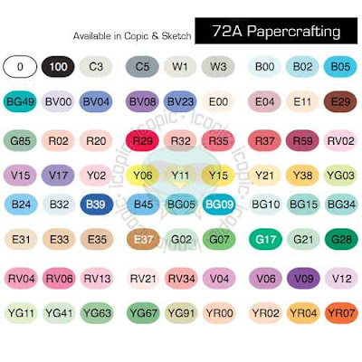
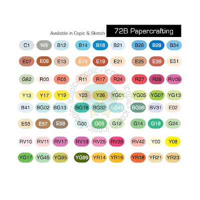
For reference, here are the colors that come in both of the 72pc Papercrafting Sets:


(There are other sets, but I don't find those worth mentioning...lol!)


While you do get some really good color choices in these sets, I think there are several great colors and combos you miss out on in these kits.


Here are the colors that I use very often that are not included in these two sets:


First off, I like having all of the 0000 and/or 000 for blending. I think you can achieve much more dynamic and visually interesting shading when you have the lightest colors to blend with. (I especially like the B0000 and BG0000 for coloring snow, snowmen, snowflakes, ice etc)


I think more gray values are necessary for your collection including: C7 C9 C1 W5 W7 W9 (in order to color "black" with dimension I feel you need to have C1-3-5-7-9 or equivalent in the Warm, Toner or Neutral Grays


My favorite colors for denim are B91 (B93 or B95) B97
A tried and true pink combo- R81 R83 R85


While I love the E30's range for coloring things brown like wood and animals, for skin tones I would definately recommend E0000 E000 E23 E27 (plus E29 and E21 E25 which come in set A and Set B respectively)


I adore E71 E74 E77 for a vintage/ greyish brown- like the color of a man's suit/briefcase or shoes
I think for Blue Green you have to have BG70 BG72 BG75 BG78 - for coloring ponds or deep water (this combo is used on the image below on the bows, skirt, and stockings).
One of my favorite dusty purples combos is V91 V93 V95 (this combo is used on the dress below)


Things to Consider when Selecting Color Combinations-


1. I think the smartest /most frugal way to select your marker colors is to first determine your style. Look at your stamp collection and decide what colors you would like to have to make your images come to life. Consider your style...do you prefer bold bright colors and bling, or is faded vintage shabby chic your style? Are you a pastel or earth tone lover...etc


2. Look around at blogs to see what color combos others are using and what looks they achieve.


3. Pick a selection of 3 markers from each of the following color families + the very lightest color of the family.


Red (example R0000 R35 R37 R39) or (R000 R81 R83 R85)


Red- Violet (example RV000 RV10 RV32)


Yellow -Red (example YR0000 YR12 YR15 YR18)


Yellow (example Y0000 Y21 Y26 Y28)


Yellow -Green ( example YG000 YG93 YG95 YG97)


Green ( example G000 G21G24 G28)


or chose the following combo of YG and G for coloring landscapes and greenery- G99, YG67, YG63, YG03, G20 + YG000 G0000 G85 (link to example picture here)


Blue -Green (example BG0000 BG70 BG72 BG75)


Blue (example B0000 B91 B95 B97)


Blue- Violet (example BV0000 BV11 BV13 BV17)


Violet (example V0000 V12 V15 V17)


Earth (example E000 E00 E11 E21 +E25 E27 E29)


Gray (example C00 C3 C5 C7)


Plus a Colorless Blender 0


Below is a chart of some other combinations that work together grouped by Basic, Bright, Earth or Pastel... to give you an idea of how different color combinations can suit different styles of paper and stamping.
A good way to start your collection would be to select 4 markers from each color family + the colorless blender. I would also suggest if budgets allow to select an additional 3 from the Earth family. This would give you a collection of 52 markers to start out with.

Stamped Images:


The Greeting Farm (B90's) image colored on Copic X-Press It Blending Card


Tiddly Inks (E70's) image colored on Paper Trey Ink Stampers Select White


Sureya's Open Coloring Book http://sureya.deviantart.com/gallery/25150012 (V90's and BG70's) images colored on Boise HD Color Copy Cover


Monday, June 27, 2011

Copic Color Combo Ideas and coloring denim...

Today, I thought I would share a compilation of some copic color combo ideas that I have come across on my Internet browsing travels.

The Color Me Copic blog has a great video tutorial on coloring denim done by The Amazing AMY my personal copic hero!!! I decided to color a little denim myself. For my example image, I chose a stamp from the Miss Anya Hats Off collection by The Greeting Farm. I probably should have worked with full jeans instead of a denim skirt but I still like the look. Amy shows a very neat trick using the colorless blender solution to add denim texture to your image. I need to find myself a denim swatch to use for that. I have added some white detailing to my images using a White Sharpie Poster Paint Fine tip pen.


Many online stores offer copic bundles with pretty good pricing. I like that they take the guess work out of choosing colors. Some of the ones that have caught my eye recently when I was browsing the Splitcoast Stampers site were The Stamp Room and Make It Crafty. I thought I would take a minute to share the color combos they offer in case any one is in need of color suggestions.


Color Combos sold by The Stamp Room:


CAUCASIAN 1- E000 E00 E11


CAUCASIAN 1B- E000 E00 E11 R20


CAUCASIAN 2- E000 E00 E21


AFRICAN AMERICAN 1-E11 E13 E21 E25


SANDY BLONDE- E40 E42 E44


DARK BRUNETTE- E25 E49 E53 E59


BRUNETTE- E25 E31 E50


BLONDE 1- Y21 E97 E99


AUBURN W/ GOLD HIGHLIGHTS- E15 E18 YR21


RED 1- R22 R24 R27 R29


PINK- R81 R83 R85


REDDISH PLUM- RV91 RV93 RV95 RV99


ORANGE RED- R00 R02 R05 R08


ORANGE/PUMPKIN- YR12 YR15 YR18


GREEN #1-G20 YG63 YG67


LEAVES AND GRASS- G20 G85 G99


OLIVE #1- G40 G94 G99


NORTHERN OCEAN- BG70 BG72 BG75 BG78


DARK BLUE GREEN- BG93 BG96 BG99


SKY BLUE- B21 B23 B24


MEDIUM BLUE- B32 B34 B37


DENIM- B91 B95 B97


VIOLET- V12 V15 V17


BLUE VIOLET 1- BV11 BV13 BV17


BLUE VIOLET 2- BV20 BV23 BV25


GRAY PLUM- V91 V93 V95


WARM GRAY- W0 W1 W3 W5 W7


COOL GRAY- C00, C1, C3, C5, C7


Make it Crafty also has some cool videos that are much longer than the standard You Tube time frame.... here on her blog. I just love watching her color and adore her Australian accent!


She uses these interesting color combos... I just love what she calls them and her accent!!!


Light Skin Colour SetE00, E01, E11 for pinkish skin


E50, E53 for a light olive complexion


Hair
‘Dusty Blonde Set‘YR31, Y18, Y28
Auburn hair – E13, E17, E19


Clothing
Rustic Blue Set B93, B95, B97, B99
Pretty Pink Set – R81, R83, R85, R89


Wood/Trees/Fur
‘Dusty Brown hair E41, E44, E47, E49


Leaves
‘Flora Green‘ G40, YG63, G28


Flowers
‘Purple Set‘.BV00, BV13, V17



Here are the copic color combinations inspired by Paper Trey Ink colors:


Plum Pudding V91 V95 V99


Lavender Moon RV32 RV34 V06


Scarlet Jewel R83 R85 R89


Pure Poppy R24 R29 R59


Raspberry Fizz RV04 RV17 RV19


Hibiscus Burst RV10 RV13 RV14


Sweet Blush R20 R22 R24


Berry Sorbet R30 R32 R35


Terracotta Tile YR65 E08 E19


Orange Zest YR12 YR15 YR18


Melon Berry R01 R02 R05


Summer Sunrise Y32 Y35 Y38


Harvest Gold Y21 YR23 YR24


Lemon Tart Y21 Y26 YR24


Pinefeather G24 G28 BG99


New Leaf YG11 YG13 YG17


Ripe Avocado YG93 YG95 YG97


Simply Chartreuse YG23 YG25 YG95


Spring Moss YG91 YG93 YG95


Enchanted Evening B95 B97 B99


Blueberry Sky B91 B34 B97


Spring Rain B41 B45 B37


Hawaiian Shores BG15 BG23 BG49


Ocean Tides BG72 BG75 BG78


Aqua Mist BG11 BG13 BG18


Dark Chocolate E55 E57 E59


Fine Linen E41 E42 E44


Smokey Shadow T1 T4 T6

Royal Velvet BV13 BV08 BV29

Happy Mother's Day Card

MICHELLE'S MBELLISHMENTS Happy Mother's Day Card A fun fold design featuring the Boutique Blossoms Bundle This week's card was a...