Tuesday, July 26, 2011

Choosing Copic Color Combinations Revisted

Copic Markers come in 346 colors. That is a lot to choose from and the selection process can be very overwhelming. Let's face it, these markers ain't cheap! Since we know the price per marker is going up as of August 1st... it now more important than ever to wisely choose which colors we purchase.


I have seen people ask many times if it is better to purchase individual markers or should they just get one of the pre-packaged sets. I am torn on that question. While the paper crafting sets have great colors that work together, they also are missing some "VIP" colors in my opinion. Since the sets also don't necessarily offer a cost savings or "deal" over picking your own colors I say - it is probably best to purchase markers individually.


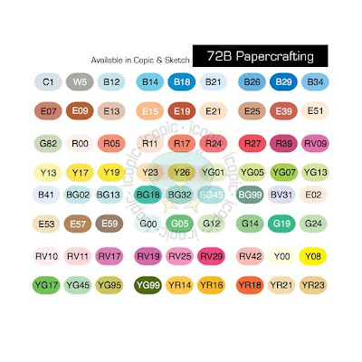
For reference, here are the colors that come in both of the 72pc Papercrafting Sets:


(There are other sets, but I don't find those worth mentioning...lol!)
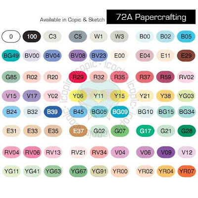


While you do get some really good color choices in these sets, I think there are several great colors and combos you miss out on in these kits.


Here are the colors that I use very often that are not included in these two sets:


First off, I like having all of the 0000 and/or 000 for blending. I think you can achieve much more dynamic and visually interesting shading when you have the lightest colors to blend with. (I especially like the B0000 and BG0000 for coloring snow, snowmen, snowflakes, ice etc)


I think more gray values are necessary for your collection including: C7 C9 C1 W5 W7 W9 (in order to color "black" with dimension I feel you need to have C1-3-5-7-9 or equivalent in the Warm, Toner or Neutral Grays


My favorite colors for denim are B91 (B93 or B95) B97

A tried and true pink combo- R81 R83 R85


While I love the E30's range for coloring things brown like wood and animals, for skin tones I would definately recommend E0000 E000 E23 E27 (plus E29 and E21 E25 which come in set A and Set B respectively)


I adore E71 E74 E77 for a vintage/ greyish brown- like the color of a man's suit/briefcase or shoes

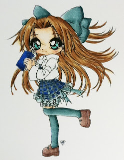
I think for Blue Green you have to have BG70 BG72 BG75 BG78 - for coloring ponds or deep water (this combo is used on the image below on the bows, skirt, and stockings).
One of my favorite dusty purples combos is V91 V93 V95 (this combo is used on the dress below)


Things to Consider when Selecting Color Combinations-


1. I think the smartest /most frugal way to select your marker colors is to first determine your style. Look at your stamp collection and decide what colors you would like to have to make your images come to life. Consider your style...do you prefer bold bright colors and bling, or is faded vintage shabby chic your style? Are you a pastel or earth tone lover...etc


2. Look around at blogs to see what color combos others are using and what looks they achieve.


3. Pick a selection of 3 markers from each of the following color families + the very lightest color of the family.


Red (example R0000 R35 R37 R39) or (R000 R81 R83 R85)


Red- Violet (example RV000 RV10 RV32)


Yellow -Red (example YR0000 YR12 YR15 YR18)


Yellow (example Y0000 Y21 Y26 Y28)


Yellow -Green ( example YG000 YG93 YG95 YG97)


Green ( example G000 G21G24 G28)


or chose the following combo of YG and G for coloring landscapes and greenery- G99, YG67, YG63, YG03, G20 + YG000 G0000 G85 (link to example picture here)


Blue -Green (example BG0000 BG70 BG72 BG75)


Blue (example B0000 B91 B95 B97)


Blue- Violet (example BV0000 BV11 BV13 BV17)


Violet (example V0000 V12 V15 V17)


Earth (example E000 E00 E11 E21 +E25 E27 E29)


Gray (example C00 C3 C5 C7)


Plus a Colorless Blender 0


Below is a chart of some other combinations that work together grouped by Basic, Bright, Earth or Pastel... to give you an idea of how different color combinations can suit different styles of paper and stamping.
A good way to start your collection would be to select 4 markers from each color family + the colorless blender. I would also suggest if budgets allow to select an additional 3 from the Earth family. This would give you a collection of 52 markers to start out with.

Stamped Images:


The Greeting Farm (B90's) image colored on Copic X-Press It Blending Card


Tiddly Inks (E70's) image colored on Paper Trey Ink Stampers Select White


Sureya's Open Coloring Book http://sureya.deviantart.com/gallery/25150012 (V90's and BG70's) images colored on Boise HD Color Copy Cover


Follow Your Dreams

Hellooooo! How is everyone on this lovely Tuesday? I am so pleased that it is not so hot today. Only 90 degrees. It was over 100 over the weekend and that forced me to stay indoors. I do not do well in the heat at all. In this case staying in was actually a good thing because it gave me some time to do some card making. I have had a few images all colored up for a while but never got a chance to make any cards out of them.
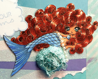
Here is one card that I made for my best friend Gina. She just got a well deserved promotion so I am going to give her this card at her celebratory dinner this weekend. ....I will have another card for you tomorrow that I made for my other bestie Rhiannon to congratulate her on her promotion...Marle and Tasmine just got married and now Gina and Rhiannon just got promoted. My girls rock!
Supplies-

Stamps- Siren Lorelei from Make It Crafty, PaperTrey Ink Fillable Frames #3

Paper-Me & My Big Ideas Starfish Specialty patterned paper, PTI Aqua Mist Cardstock, Copic X-Press It Blending Card

Accessories- Recollections pearls, Japanese deco masking tape, Making Memories trim

Copics-

Hair: E13 E08 E09 E17 E19 E18

Skin: E11 E13 E15

Tail: B000 B21 B23 + Prismacolor Pencils PC1102 Blue Lake, PC1088 Muted Turquiose, PC 933 Violet Blue for shading

Eyes- BG15


Thursday, July 21, 2011

Monochromatic Birthday

Just popping in with a quick and simple card to share. It is just a simple birthday card, no coloring and nothing fancy. I kept it pretty monochromatic focused on the PTI Aqua Mist cardstock with some green and beige thrown in. This poor card was defiled today. I was on my way to work , sleeping on the bus as usual and when I woke up the floor was all wet and so was my tote bag. Apparently the woman sitting next to me spilled her water all over everything and didn't bother to mention it... and well my card got all soggy. I am hoping it will dry and not be too damaged...but at least I got a good picture of it before the flood!

Supplies- Studio Callico Sentiment stamp, PTI Aqua Mist cardstock, DCWV Linen Closet paper stack, Memento London Fog Ink, Pearls Rhinestones Ribbon Prima flowers and Making Memories butterfly from Stash, Tim Holtz Alterations Ornamental and Oval Nestabilities dies, Copic BG13


Monday, July 11, 2011

Love Gives Us A Fairytale

Happy Monday! It is day one of my vacation. Yay! Staycations are a wonderful thing. Day one I have completed two things on my list of to-do's. Grocery shopping and laundry, check! I also made a card last night...one of the benefits of being able to stay up late. This is a card I made for my best friend as a congratulations for her wedding. Her wedding is royal themed and Princess Tiana was on her Save the Dates. She even has this cute little Tiana doll that she takes around with her. I think it is a form a stress relief. My friend even looks just like Tiana so I thought this was perfect.

Supplies- Princess Tiana coloring page, PTI Lavender Moon cardstock, Best Creations Powder Blue Glitter Cardstock, Kaisercraft Magic Happens Topaz patterned paper, Want to Scrap Pearls, Nestabilities Label 1, Silver Spica pen, Copcis: C00 C1 C3 C5 B0000 E11 E1 E21 E23 E25 E27 E29 R21 R22 B23


Saturday, July 9, 2011

New site COPIC COLOR and how to test your paper

Today I have a cool website and a comparison of two cardstocks for Copic coloring to share with you. The image above on the left is colored with Boise HD Color Copy Cover and the image on the right is colored on Copic X-Press It Blending Card.


I don't get to surf the web as much as I would like to anymore so I am not sure if this is new news for any of you.... but I just found a great site called Copiccolor.com-The online community for copic fans and collectors. This is an off shoot of Too International's Copicmarker.com site and it is fabulous! Why do I think that you ask...well it is mobile optimized. This means it behaves much like Facebook...you can even login to the site via your facebook profile. So if you have an iPhone you can walk with your copic marker collection info in a neat and easy to view way. No more carrying paper lists or your whole copic journal when you go to the store. it is great because you can select which copic marker colors you have and even what type...original, sketch, ciao, wide, refill...etc.... That is one major problem I always have...remembering which copic refill colors I have versus which ones I need/ want... This tool allows you to have a mobile/online version of which ones you want versus which ones you have. NO MORE ACCIDENTAL DUPE PURCHASES or forgetting to pick something up while you are out.


Another great feature of this site is the communities... there is a really great one just for PAPERCRAFTERS....you can see all the latest creations from all your favorite papercrafters...and they list what copic colors they used on their project. You can even follow them just like you would on Facebook or Twitter...so no more visiting every individual blog out there just to get some inspiration...just log in to CopicColor and visit the Papercrafters page to see some gorgeous coloring! Loving this!


I am sure there is more to love on there too but I only just discovered the site yesterday after "Like"ing the Copic Markers page on Facebook.


Copic Tip: How to select the right cardstock for your copics...

This is a very subjective topic. Everyone has their favorite cardstock to use with their markers. My favorite is X-Press It Blending Card. I find that that is the easiest cardstock for me to use as far as ease and quickness of blending. Well most of you know that X-Press It cardstock is expensive because it is imported from down under... I have gone through most of what stock I have very quickly and was trying to decide if it was in my budget to re-order when I came across a post on Splitcoast Stampers regarding what the best cardstock for copics is. Someone said they got a sample of Hammermill Color Copy Cover from Staples and they liked that better than Neenah Cardstock. I used to use PTI, then Neenah, then CC Designs as far as my favorite cardstocks to use so this post intrigued me. I googled the Hammermill and saw it was sold by one of my clients at work...TigerDirect.com. My favorite client that I deal with on a daily basis at work is this fabulous lady that works at Tiger's sister company. Well a lightbulb went off in my head...I wonder if she gets an employee discount. Well I decided to ask her and she told me she can order from their catalog at cost. So when we searched for the Hammermill they had it but not 8.5X 11 size. She found something similar called Boise HD Color Copy Cover. This one had the same brightness (98) same weight (80lb). I decided for $9.50 a for a ream of 250 sheets I might as well try it out. After shipping it came to under $15. That is approx. $.06 a sheet. I received the ream 3 days after placing the order.


HOW TO TEST PAPER WITH COPIC MARKERS

1. Draw a circle using a Copic Multiliner Pen.


2. Use a light color marker (R20) to color about half the circle right up to the line and let dry for 10 minutes.


3. Check to see if the ink bleeds or feathers past the edge or your circle.


4. Check to see if the ink looks even and well blended and the color looks bright not faded and too speckled with white. Your overall goal should be a smooth blended image with no streaking.


5. Turn the cardstock over and check to see if the ink saturates the back and looks even.

6. Check to see if you are able to correct mistakes using your O colorless blender marker.


If your cardstock passes these tests...it is ok to use with your copic markers.


Here I compared the Boise HD Color Copy Cover to Copic X-Press It Blending Card.


Price: Boise- $.06 per sheet ($15 for 250 sheets) vs. X-Press It $.46 per sheet ($57.99 for 125 sheets) WINNER- BOISE


Weight: Boise- 80 lb vs. X-Press It- 92 lb WINNER- X-PRESS IT


Smoothness: same ultrasmooth finish


Brightness: Boise- 98 vs. X-press It- unsure of the number but it is slightly less bright than the Boise WINNER- BOISE


Saturation: same


Ink Clarity: Boise- small amount of speckling vs. X-Press It- tint amount of speckling WINNER- XPRESS IT

Above- B91 B95 B97 blended on Boise


Above- B91, B95, B97 blended on X-Press It


Feathering- Boise- small amount of ink spread..or feathering vs. X-Press IT- minuscule amount of spread. Ink tends to pool on the surface of this cardstock giving you more time to work with it before drying WINNER- X-PRESS IT


Coloring Method- Boise- layering light to dark circular motion blending works best; X-Press It- dark to light flicking method works best WINNER- X-PRESS IT


COLORLESS BLENDER- Boise- takes work but can still use 0 to push ink and correct mistakes but it is hard to completely move dark colors; X-Press It- easy to correct mistakes WINNER - X-PRESS IT


OVERALL RESULT: Best Cardstock to me is still X-Press It, but if you are looking for a similar cardstock and would like a more budget friendly option, I recommend trying Boise HD Color Copy Cover. It works with copics and if you are just starting out, it is very cost effective to practice on and still have beautiful results.

Stamp used for image- The Greeting Farm Miss Anya Hats Off, Memento Tuxedo Black Ink, Copics: Skin- E23, E25, E27, E29 Hair- E23, E25, E27, E29, E49 Denim- B91, B95, B97 Clothes- RV00, RV63, RV66, V91, V93, V95, Boots- E31, E33, E34, E35, E37

Tuesday, July 5, 2011

Vintage Inspired


Happy Tuesday! Feels like a Monday -just getting back into the swing of things after 4th of July Weekend. Boy am I tired. The neighbors were partying and firing off firecrackers into the wee hours of the morning.


My card today is one that I made this with bits and bobs that I had lying around. I found the main mat with the sewing in my scrap bin...I guess it was a leftover from when I first got my Jenome Sew Mini machine. I thought I would use that as my focal piece of my card and dress it up with some vintage inspired embellishments and make a quick card.

I used my V93 copic marker to add some color to the paper roses.

Supplies-

Stamp- Amy R Stamps, Cardstock PTI and Stampin Up!, Retire SU! patterned paper, Crimper, Janome Sew Mini, Basic Grey trim, Want 2 Scrap pearls, Nestabilities, Paper Roses and Hatpin and Antique Lace from Stash, Copic Marker V93

Monday, June 27, 2011

Copic Color Combo Ideas and coloring denim...

Today, I thought I would share a compilation of some copic color combo ideas that I have come across on my Internet browsing travels.

The Color Me Copic blog has a great video tutorial on coloring denim done by The Amazing AMY my personal copic hero!!! I decided to color a little denim myself. For my example image, I chose a stamp from the Miss Anya Hats Off collection by The Greeting Farm. I probably should have worked with full jeans instead of a denim skirt but I still like the look. Amy shows a very neat trick using the colorless blender solution to add denim texture to your image. I need to find myself a denim swatch to use for that. I have added some white detailing to my images using a White Sharpie Poster Paint Fine tip pen.


Many online stores offer copic bundles with pretty good pricing. I like that they take the guess work out of choosing colors. Some of the ones that have caught my eye recently when I was browsing the Splitcoast Stampers site were The Stamp Room and Make It Crafty. I thought I would take a minute to share the color combos they offer in case any one is in need of color suggestions.


Color Combos sold by The Stamp Room:


CAUCASIAN 1- E000 E00 E11


CAUCASIAN 1B- E000 E00 E11 R20


CAUCASIAN 2- E000 E00 E21


AFRICAN AMERICAN 1-E11 E13 E21 E25


SANDY BLONDE- E40 E42 E44


DARK BRUNETTE- E25 E49 E53 E59


BRUNETTE- E25 E31 E50


BLONDE 1- Y21 E97 E99


AUBURN W/ GOLD HIGHLIGHTS- E15 E18 YR21


RED 1- R22 R24 R27 R29


PINK- R81 R83 R85


REDDISH PLUM- RV91 RV93 RV95 RV99


ORANGE RED- R00 R02 R05 R08


ORANGE/PUMPKIN- YR12 YR15 YR18


GREEN #1-G20 YG63 YG67


LEAVES AND GRASS- G20 G85 G99


OLIVE #1- G40 G94 G99


NORTHERN OCEAN- BG70 BG72 BG75 BG78


DARK BLUE GREEN- BG93 BG96 BG99


SKY BLUE- B21 B23 B24


MEDIUM BLUE- B32 B34 B37


DENIM- B91 B95 B97


VIOLET- V12 V15 V17


BLUE VIOLET 1- BV11 BV13 BV17


BLUE VIOLET 2- BV20 BV23 BV25


GRAY PLUM- V91 V93 V95


WARM GRAY- W0 W1 W3 W5 W7


COOL GRAY- C00, C1, C3, C5, C7


Make it Crafty also has some cool videos that are much longer than the standard You Tube time frame.... here on her blog. I just love watching her color and adore her Australian accent!


She uses these interesting color combos... I just love what she calls them and her accent!!!


Light Skin Colour SetE00, E01, E11 for pinkish skin


E50, E53 for a light olive complexion


Hair
Dusty Blonde Set‘YR31, Y18, Y28
Auburn hair – E13, E17, E19


Clothing
Rustic Blue Set B93, B95, B97, B99
Pretty Pink Set – R81, R83, R85, R89


Wood/Trees/Fur
Dusty Brown hair E41, E44, E47, E49


Leaves
Flora Green‘ G40, YG63, G28


Flowers
Purple Set‘.BV00, BV13, V17


Here are the copic color combinations inspired by Paper Trey Ink colors:


Plum Pudding V91 V95 V99


Lavender Moon RV32 RV34 V06


Scarlet Jewel R83 R85 R89


Pure Poppy R24 R29 R59


Raspberry Fizz RV04 RV17 RV19


Hibiscus Burst RV10 RV13 RV14


Sweet Blush R20 R22 R24


Berry Sorbet R30 R32 R35


Terracotta Tile YR65 E08 E19


Orange Zest YR12 YR15 YR18


Melon Berry R01 R02 R05


Summer Sunrise Y32 Y35 Y38


Harvest Gold Y21 YR23 YR24


Lemon Tart Y21 Y26 YR24


Pinefeather G24 G28 BG99


New Leaf YG11 YG13 YG17


Ripe Avocado YG93 YG95 YG97


Simply Chartreuse YG23 YG25 YG95


Spring Moss YG91 YG93 YG95


Enchanted Evening B95 B97 B99


Blueberry Sky B91 B34 B97


Spring Rain B41 B45 B37


Hawaiian Shores BG15 BG23 BG49


Ocean Tides BG72 BG75 BG78


Aqua Mist BG11 BG13 BG18


Dark Chocolate E55 E57 E59


Fine Linen E41 E42 E44


Smokey Shadow T1 T4 T6

Royal Velvet BV13 BV08 BV29

Have A Groovy Day!

Happy Monday! I have two things to share today. First and foremost, I made a new card over the weekend. I know, shocking, right? I was watching a True Blood Marathon all weekend...I wanted to watch from the very beginning up until the new episode. I came in half way through the series and so I wanted to fill in all the blanks before starting the new season. Well that was a whole lot of episodes...I had to watch all of season 1 and part of season 2 and half of season 3 so I figured why not play with my copics too! Well that turned into me rearranging all of my markers and finally coloring in the 2011 Copic Marker Color Chart with all the new colors. That is the second thing I wanted to share. Below is the new 2011 chart. I am just 12-13 colors away from having all the Copics that I care to own. ( I don't really have any interest in all the greys or fluorescent markers).


Card Supplies: Lil August digi by Tickled Pink Stamps, Sentiment Amy R Stamps, PTI Cardstock and patterned paper, Copic X-Press It Blending Card, Nestabilities, Prima pearls/rhinestone flourish, Rain Dots, Tim Holtz Symphony Tissue Tape, Basic Grey trim, Pear Tart Memento Ink, Copics: skin-E00, E11, R20, hair- YR30, YR31, E23, clothes- BG70, BG72, BG75, BG78, BG53, headphones- C1, C5, C7

Tuesday, June 21, 2011

Father's day card and Copic Storage

I just wanted to share the Father's Day card I made for my Dad over the weekend. It seems monumental that I actually made two cards in one week so I am very proud. Apparently he liked the card because it is prominently displayed on the top of his entertainment center(right above the TV).

Cool Find: I found these cool clear bins called Stack Binz at Harmon Discount for $5 to put my overflow copics in. I was using the plastic containers below from Michaels and the 12 marker plastic cases some of them came in, but they kept getting knocked off the top of my main wooden storage unit that my Dad built for me, so when I saw the bins at Harmon I knew I had to get one.


Before:
This is the medium size Stack Binz and it just fits the size of a copic marker.


Here are my 50+ overflow copics and spica pens tossed into the bin!
After:

Here is a close up of the image from my father's day card.

Copic colors used are below:
Supplies: Copic X-Press It Blending card, PTI Cardstock, DCWV Safari Stack, Raffia, Foam Dots, mini clothes pins, Copics (ciao C7 E08 E42)

Sunday, June 19, 2011

Scrapbook Expo 2011 and Michael's has copics


Copic markers are now available at Michael's! The color selection is very limited but the price is good with the weekly coupon if you buyone at a time.

They have a page with instructional videos and information too.

There is also a store on line called THE STAMP ROOM that has copic bundles...which means no-brainer color choices. The bundles are fairly priced.


Back in April, I attended the annual Scrapbook Expo in my town- Somerset NJ. I love to go to this show every year because I am able to buy all sorts of cute things I would usually only be able to get on-line and everything is all in one place. Some times I will go to the classes and the crop party but this year I just walked around and watched the demos.

I mostly picked up copics and some Nesties because they had good prices on those. And TRIM! I got so many different trim and embellishments - mostly white so I could customize them. I sae a cool demo at the Rubber Cafe booth using their sheer glue and glitter that was inspired...they stamped with the glue and they made awesome glue dots with it. Got my first Mo Manning stamp too!


HAPPY FATHER'S DAY!


Friday, June 17, 2011

Happy Father's Day Grandpa!

I feel like I have been gone from my blog for ages. Haven't gotten to do any crafting lately beyond working on some wedding invitations for a friend. I made this quick card for my grandfather for Father's Day and I thought I would share it with all of you out there in bloggyland!


I hope everyone has a wonderful Father's Day Weekend!

Supplies: PTI cardstock, Best Creations paper, X-Press It Blending Card, Post -It Craft Paper Earths, Stampin' Up! Stamps, Memento Tuxedo Black Ink, Tim Holtz Alterations Vintage Market die, Stampin' Up edge punch, pearls from stash, Copic Markers- E07, G82


Happy Mother's Day Card

MICHELLE'S MBELLISHMENTS Happy Mother's Day Card A fun fold design featuring the Boutique Blossoms Bundle This week's card was a...